Designing for Discoverability: Rethinking IA at Whatfix
Timeline
6 months
Contributors
2 designers, 1 UX writer, 1 PM, 10 Developers
My role
As lead designer, I owned end-to-end design, led user research and testing, and scoped the project for roadmap delivery.
🚨 The problem
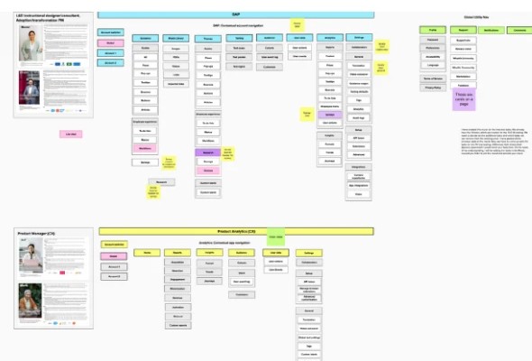
Whatfix, a SaaS platform for in-app guidance and performance support, was expanding beyond its core DAP (Digital Adoption Platform) into new offerings like Product Analytics and Enterprise Admin.
Our current Whatfix information architecture represents only our DAP offering and has key problems:
Didn't scale - not only within our DAP product but also across new product verticals like Product Analytics and Enterprise Admin
Didn't match customers mental models - both in information feature grouping, and terminology
Has low discoverability of product offerings.
We thought our IA was logical - until card sorting told a different story. Customers grouped things in surprising ways, revealing overlaps and blind spots.
The outcome of the current IA tree test results has been poor. The current Benchmark is at a failing grade of 27%.


🎯 Goal
Tree test score for UI-less test
Tree test score with UI
To set the benchmark, the methods we used were: Tree testing & Card Sorting.
🧪 Learnings From Initial Product Testing
Tree Testing
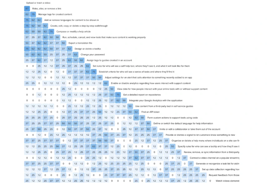
The objective of the tree test for the DAP product was to define a benchmark baseline to measure DAP success against and assess users mental models and use these insights to guide the future IA. To achieve this 17 participants were given 14 tasks and were asked where would they go to complete these tasks in our current dashboard IA.
This was a wake-up call: tasks we assumed were simple turned out to be the most confusing. It showed us exactly where people got lost.

Card Sorting
The goal of the card sort tests for the DAP product was to understand user categorization of Whatfix information and features, informing future IA. 17 participants completed an open card sort, organizing 33 cards into categories and labeling them, aiming to match customer mental models through theme analysis.

The Improvement opportunity areas discovered from the test were as follows:
- Organize tasks and categories around user mental models
- Refine navigation, labels, and terminology for clarity
- Provide multiple entry points and simplify crowded categories
- Separate and clarify settings, theming, and visibility rules
- Reorganize integrations, analytics, and reporting for clearer structure
- Build a focused, purposeful settings section (no catch-alls)
🛠️ How I Solved It
As this project is signed under NDA, contact me at adithkvn@gmail.com
I used insights from initial customer testing to adjust the existing IA, then revisited the areas that had failed. Collaborating with stakeholders and subject matter experts, I facilitated brainstorming sessions that shaped a new IA for the next round of testing.
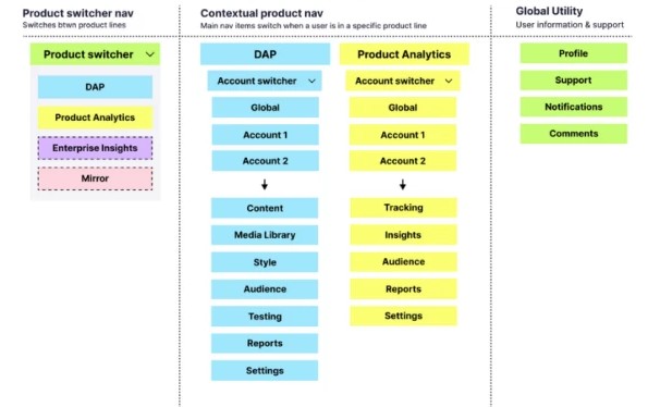
I brought these back to customers to see if the changes really moved the needle, while in parallel building early navigation prototypes so I could test the new IA in context.
Thankfully, these were the results post the final round of testing:
Tree test score without UI
Tree test score with UI
SUS score for new navigation experience
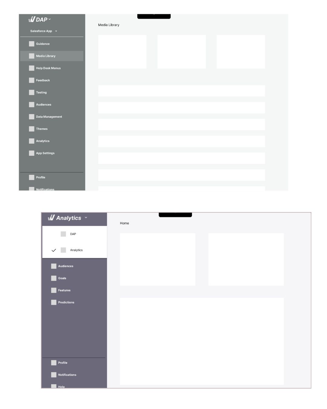
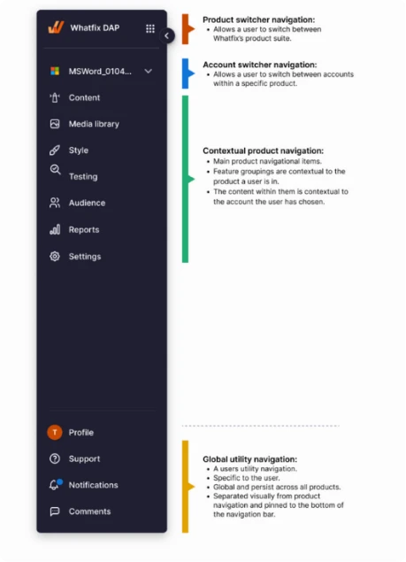
🚀 What Went Into The Product
The final IA was simpler, sharper, and tested clean. For the first time, customers could find what they needed without second-guessing.
Approximately 80% of the modifications in the new Information Architecture (IA), including terminology adjustments, regrouping, and the introduction of new navigation and multi-product switcher, were successfully integrated into the product.
📈 Impact
Post implementation, the new experience received a lot of positive customer feedback with multiple customers specifically pointing out the product team as a whole for such an improved experience.

💪 Challenges
- Recruiting target users for testing.
- Overcoming team inertia for adoption.
- Technical debt limited full rollout (80% implemented initially).
🔄 What Could Have Been Done Better
- Improved R&D-wide communication: Could have facilitated quicker alignment and reduced implementation time.
- Pre-recruitment of users for testing at project initiation: Would have streamlined the testing process and improved efficiency.
📚 Learnings
- The right test type (tree test vs. open/closed card sort) depends on the problem.
- Terminology research is critical to clarity.
- Early stakeholder alignment speeds implementation.
THE END