Scaling an enterprise tool that allows users to create in-app guides 🌱
Timeline
3 months
Contributors
3 designers, 1 researcher, 1 UX Writer, 2 PMs, 10 developers
My role
As lead designer, I owned end-to-end design, led user research and testing, and scoped the project for roadmap delivery.
Background
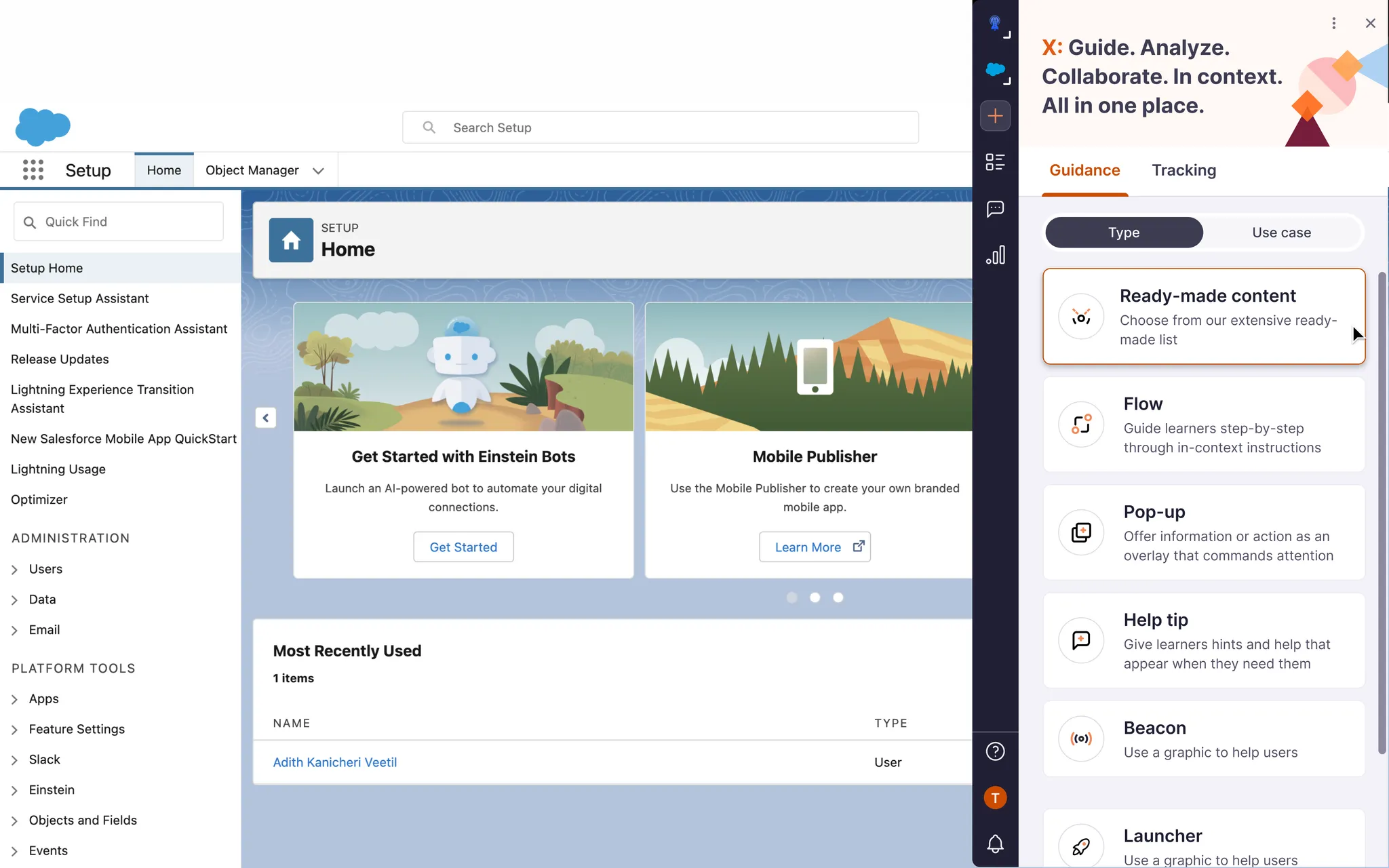
The creation extension lets clients build step-by-step guides, tips via 'i' icons, pop-ups, and other aids over their base application. My task was to make it more scalable, allowing users to complete most key tasks while improving the overall experience.
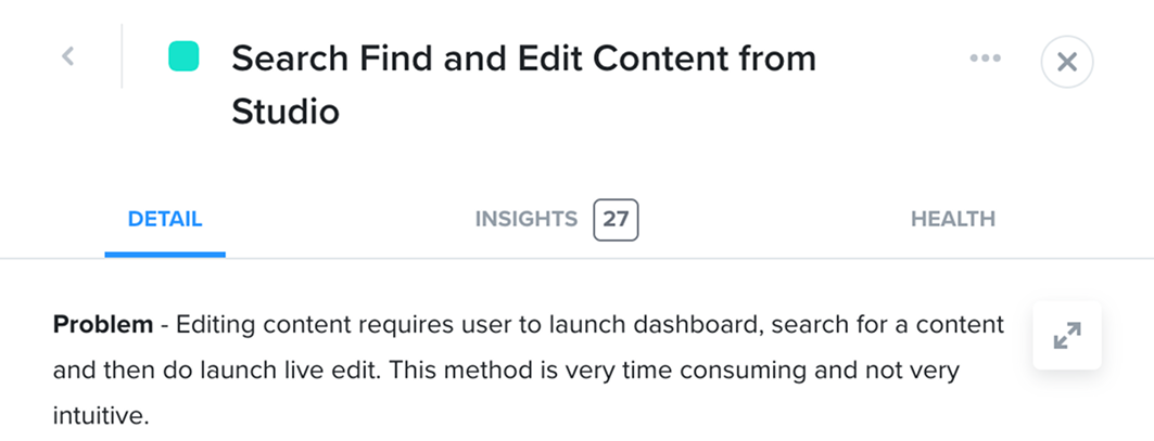
🚨 The problem
"I feel like I might break something every time I use this."
Instead of empowering users, the product was creating anxiety. Support teams were picking up the slack, but that only reinforced the problem - customers never built the confidence to navigate independently.
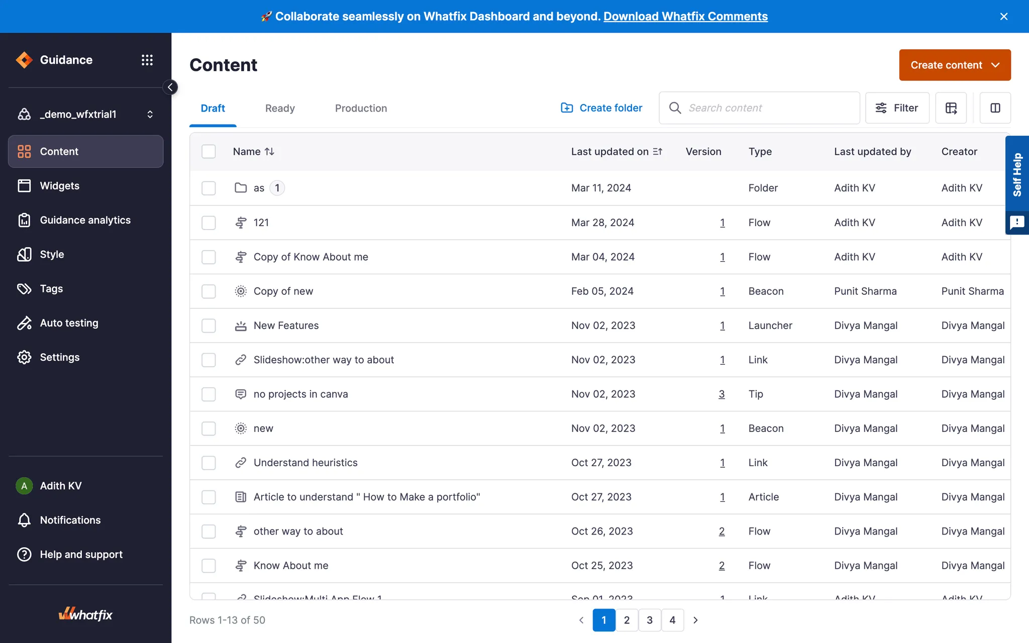
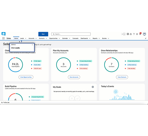
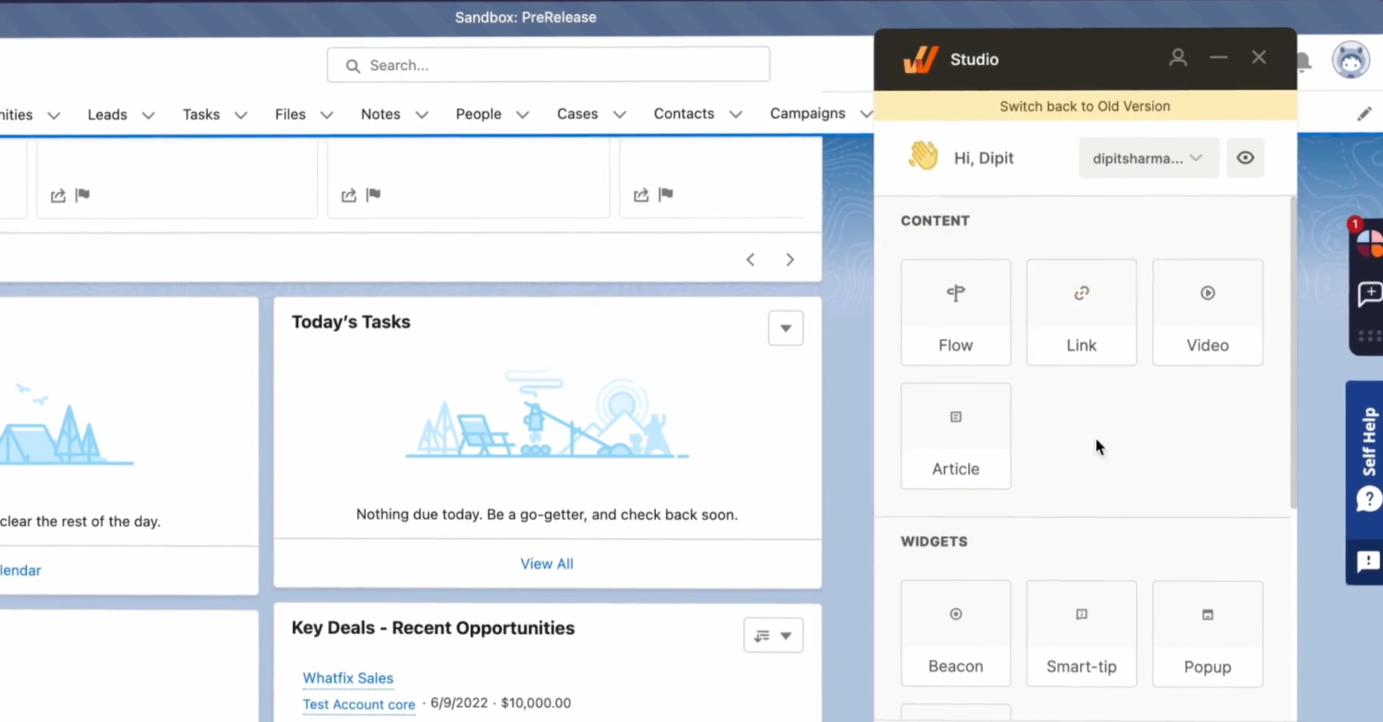
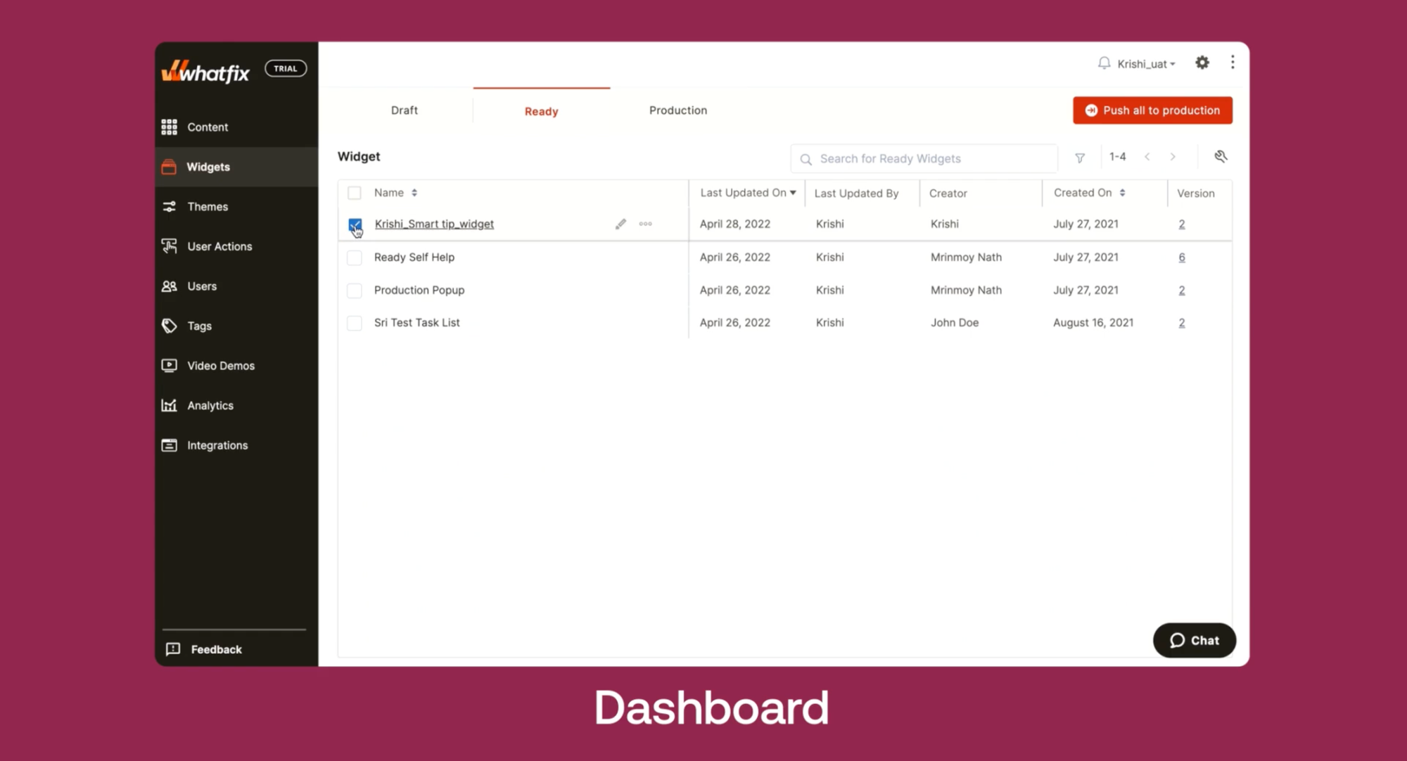
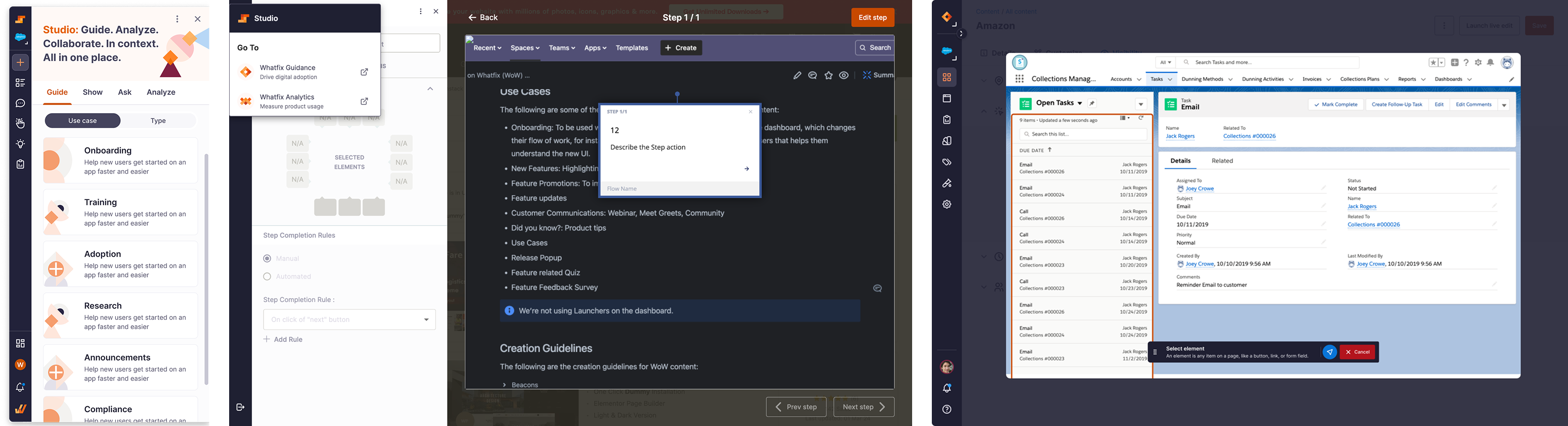
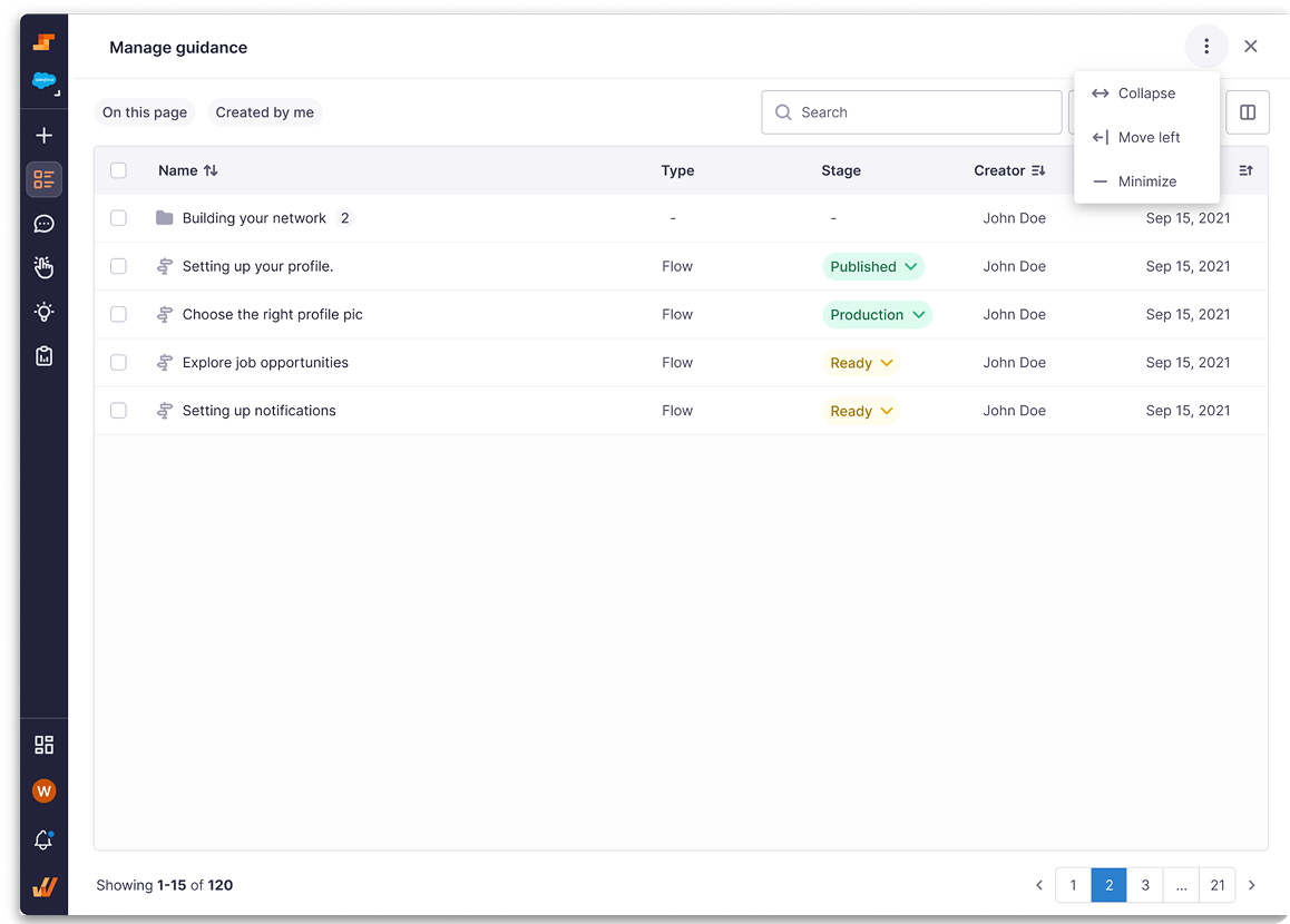
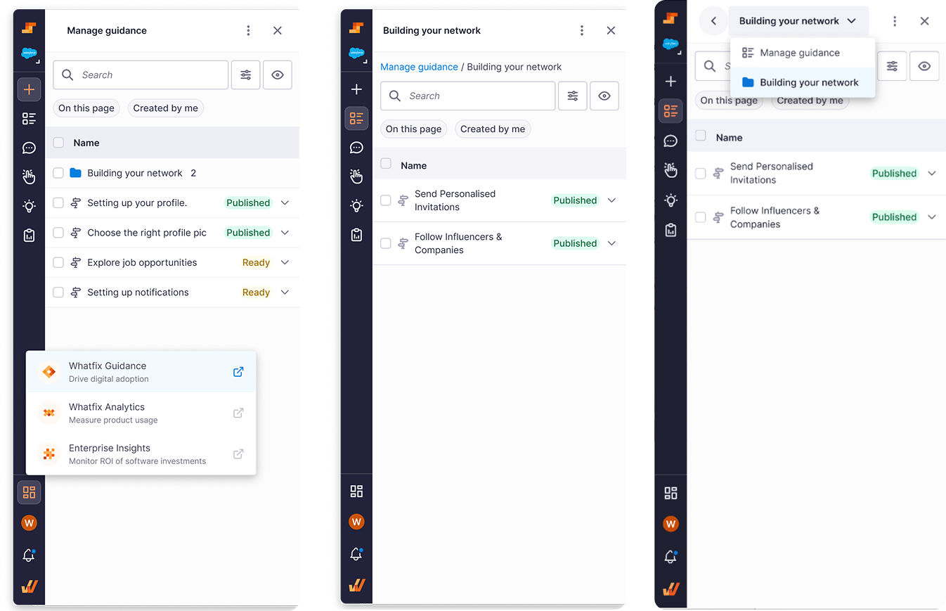
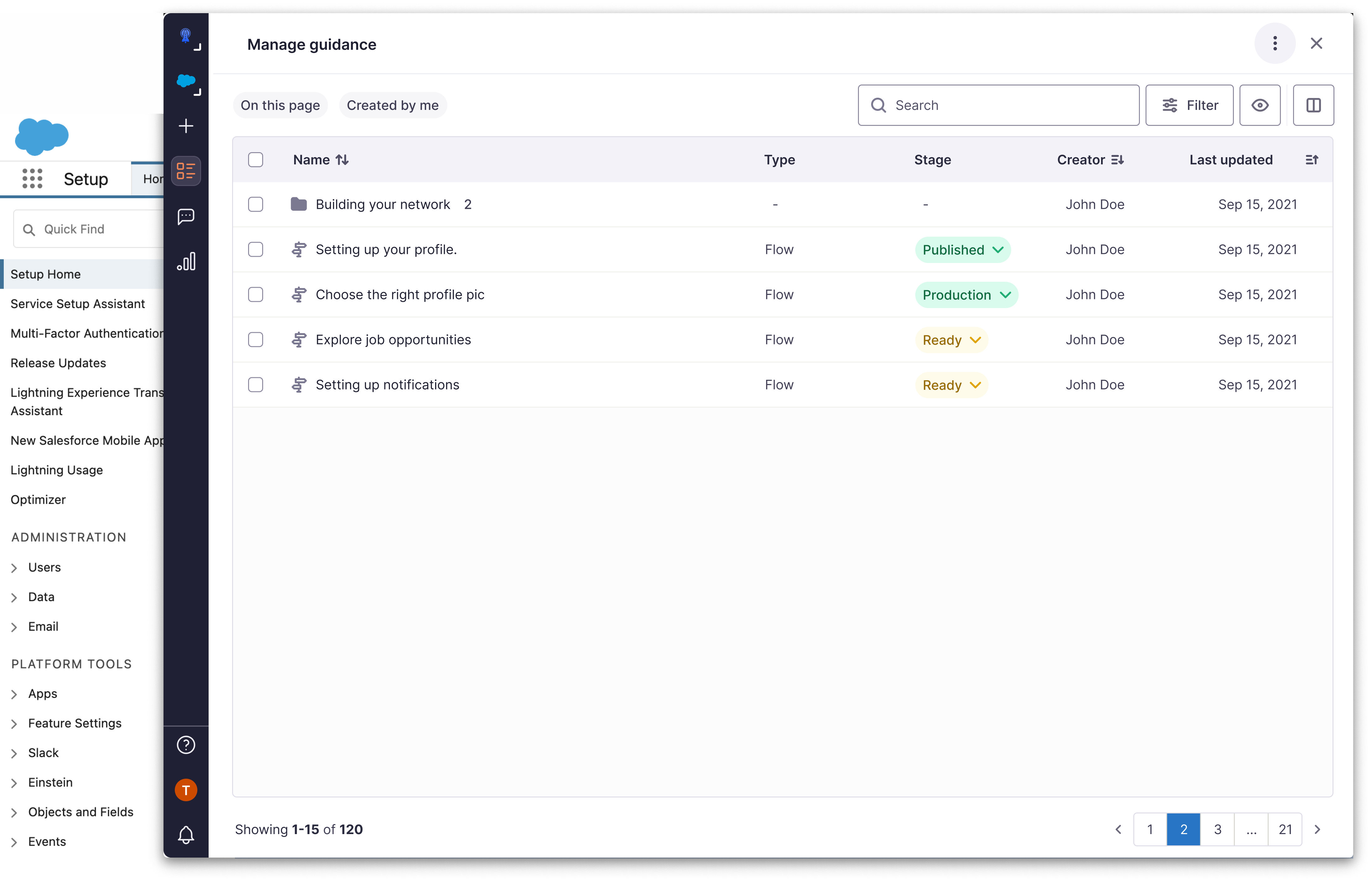
What the creation tool and dashboard looked like:
Additionally, our analysis revealed a concerning trend:
of our potential sales were lost to competitors because prospective buyers perceived the tool's appearance as outdated.
How do we reduce product-hopping and help creators bring content to life faster?
🗺️ How I solved it
As this project is signed under NDA, contact me at adithkvn@gmail.com
Discovery
I began with assumptions and scattered data. Digging into Productboard revealed recurring frustrations in content creation, confirming the problem and shaping the direction.
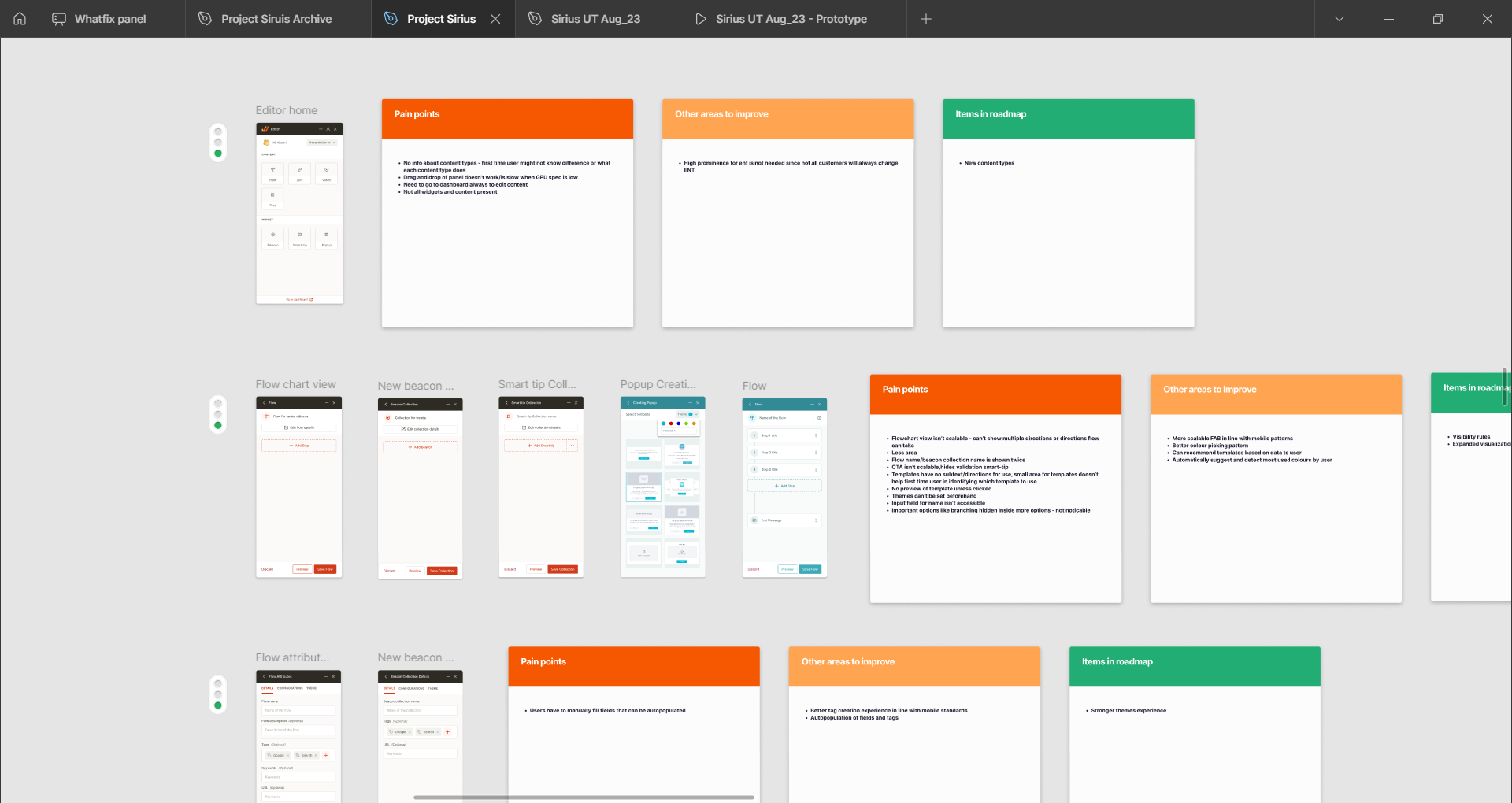
Pain Point Analysis
In Figma, I mapped pain points and compared them with the roadmap, spotting gaps and potential unmet needs for the future. This ensured alignment with long-term goals.
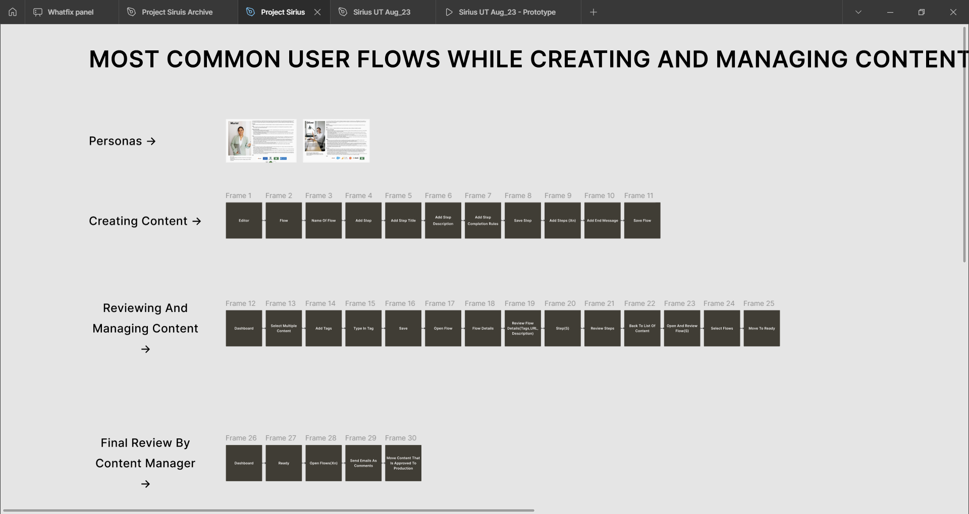
User Flow Mapping
I mapped current vs. ideal flows for core personas to ensure the design solved basic needs from the ground up. This ensured usability and value across journeys.
Form Factor Testing
From the flows, I built concepts to test. Features were clear, but form factor unclear. I tested with users and leaders. The lean left option was favoured, so I continued on.
Collaborative Design Development
Post that, I detailed screens with fellow designers, leveraging their expertise to bring freshness and multiple perspectives to the design.
It was at this point that my VP of design took an interest and pitched to the larger leadership and CEO. This helped create a buzz around it and drive a push towards productization.
Usability Testing & Iteration
After rounds of brainstorming and iteration, I ran usability tests to see how customers used the product, focusing on studio expansion, layout options, dashboard links, and folder navigation.
Navigation Refinement
User testing went smoothly and confirmed choices like dropdown folder navigation, but the dashboard link confused users, so I created new options to test again.
Stakeholder Buy-in & Scope Definition
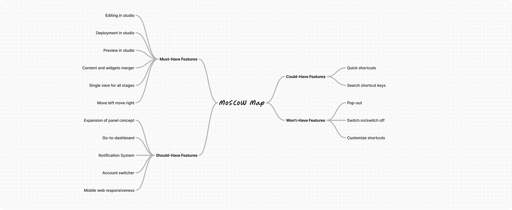
The experience was ready, but getting it built was another battle. Testing results and visibility helped me rally teams, and soon a new team was formed with the project on the roadmap. The challenge: scope was massive. To move forward, I led a MoSCoW exercise with the team to slice it down.
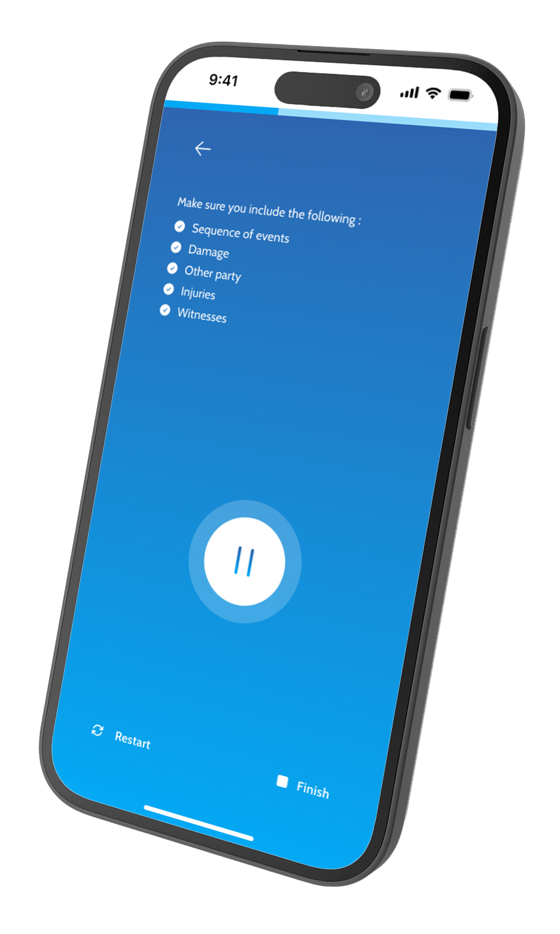
✅ Solution
Now, the creation tool is poised to grant users access to 80% of the (JBTD) Jobs-to-be-Done) throughout their journey.
This revamped experience is projected to slash the necessity to switch between the dashboard and the creation tool by an estimated 80%.
Key highlights :
Unified creation flows
Streamlined the creation process into a single, intuitive workflow that guides users step-by-step.
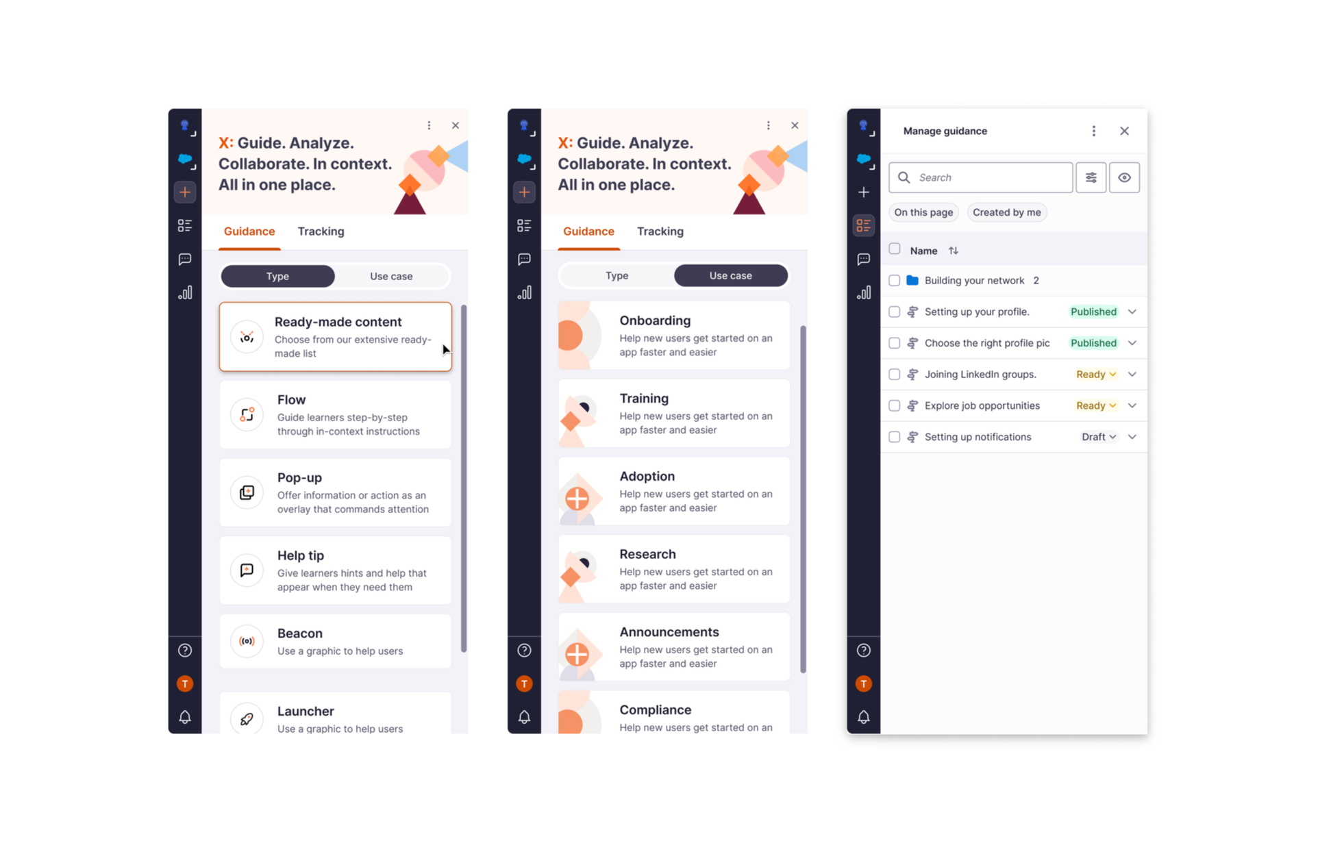
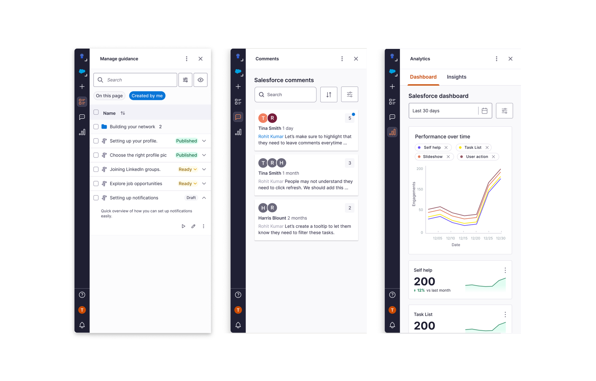
Manage, collaborate, and analyze in one place
Consolidated management, collaboration, and analytics features into a unified interface for better workflow efficiency.
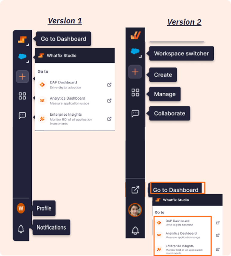
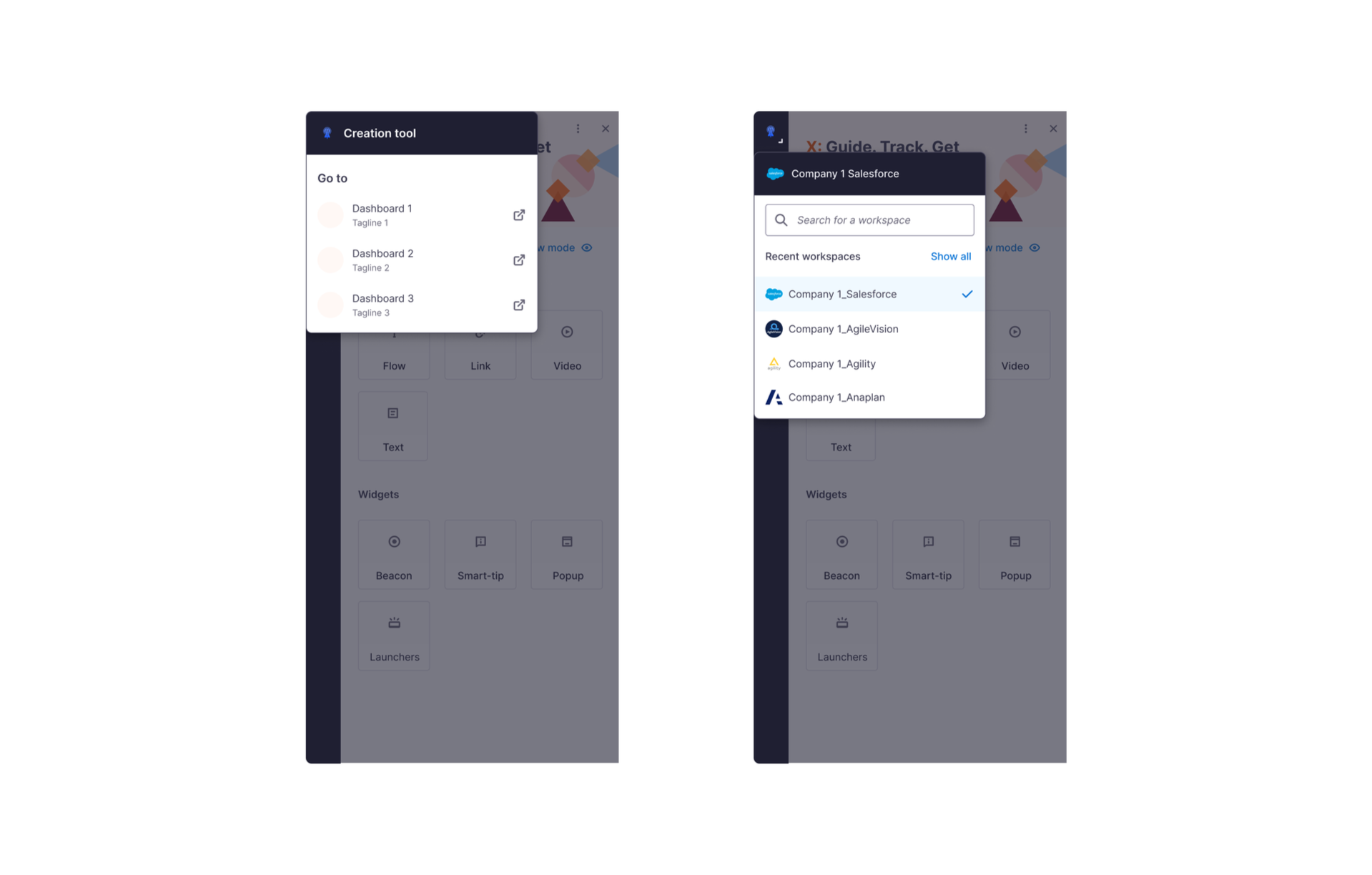
Easy workspace switching
Simplified navigation between different workspaces with clear visual indicators and seamless transitions.
Intuitive panel controls
Redesigned panel controls with clear visual hierarchy and accessible interaction patterns.
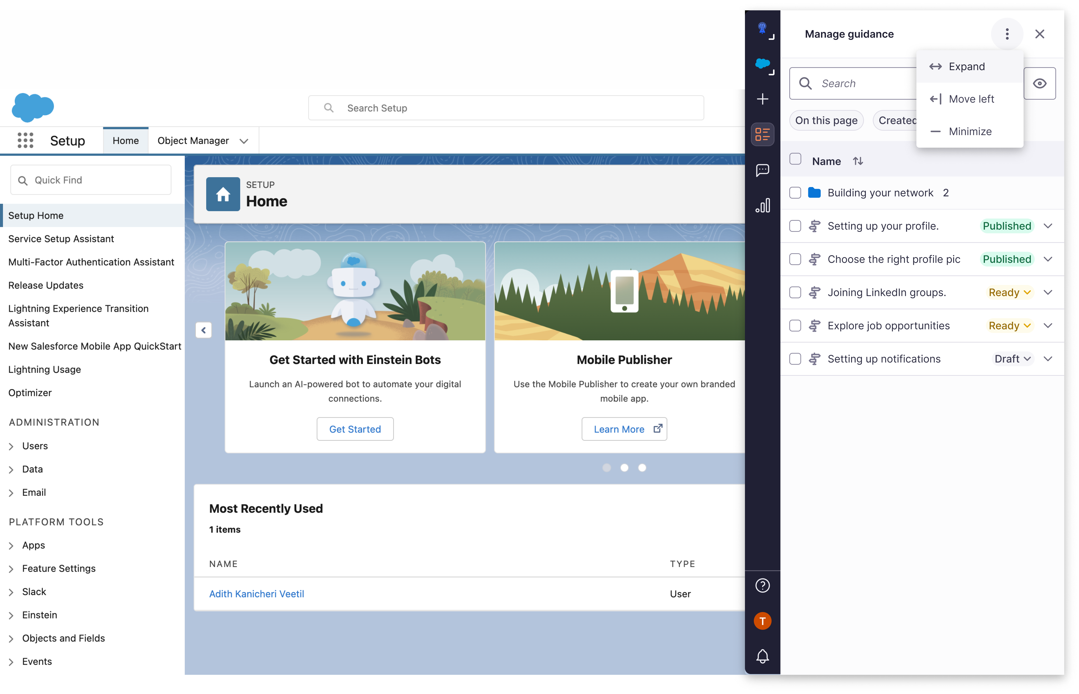
A full-width view for detailed data management
Enhanced table view that maximizes screen real estate for comprehensive data analysis and management tasks.
📈 Impact
Reduction in switching between studio and dashboard
Increase in NPS score for studio
What our customers are saying :
"The new creation flow is so much quicker! What used to take me minutes now takes seconds. It's a game-changer for our team's productivity."
"Being able to edit flows on the go without switching to the dashboard is fantastic. It's so much more intuitive and keeps me in the context of my work."
"Finally, I can see insights and analytics right where I create content. This has streamlined our process and helps us make data-driven decisions instantly."
💎 How design added value
- Identified problems from customer inquiries, NPS, and Productboard.
- Defined KRs with stakeholders and tied them to experience quality.
- Clarified Jobs-to-be-Done for creation tool vs. dashboard.
- Fixed minor issues during redesign.
- Ensured alignment with current/future KRs.
- Transformed unpredictable, fragmented experiences into clear, guided ones.
- Reduced dependency on support teams, allowing the product to scale as enterprise needs grew.
- Made the tool feel trustworthy and reliable for users at all skill levels.
🔄 What could have been better
- Pre-recruit test customers.
- Fix existing journey issues first.
- Share shorter, actionable design updates.
- Partner earlier with design system team.
📚 Learnings
- Aligning KRs with objectives secures roadmap placement.
- Concept testing before development reduces cost/rework.
- Enterprise UX isn't just about functionality, it's about confidence. Users need to trust themselves to use the tool effectively.
- The foundation of good enterprise design is clarity, predictability, and safety. Not features users rely on support to understand.
THE END