7 Days to Launch: Designing a Consumer Insurance Experience from Scratch
Timeline
1 week (weekend included)
Contributors
2 PMs, 5 Developers, 1 Underwriter, 1 Pricing manager, 1 compliance officer, CEO, entire company leadership
My role
As lead designer, ran the design sprint and in-house testing, collaborating with developers to balance scope and quality under a compressed deadline.
Background
We had just 7 days. The ask: design a consumer insurance experience from scratch, something so seamless that a leading vehicle rental company would trust us as their partner.
This wasn't a typical design sprint. There was no room for "exploration" or half-finished mockups. By the end of the week, we needed a real, working product that could convince one of the biggest vehicle rental agencies in the world to partner with us.
That meant speed, clarity, and trust had to be baked into every decision.
🚨 Problems
From day one, we faced significant challenges:
Our existing experience was manual and built for brokers, filled with jargon, and unfriendly to consumers.


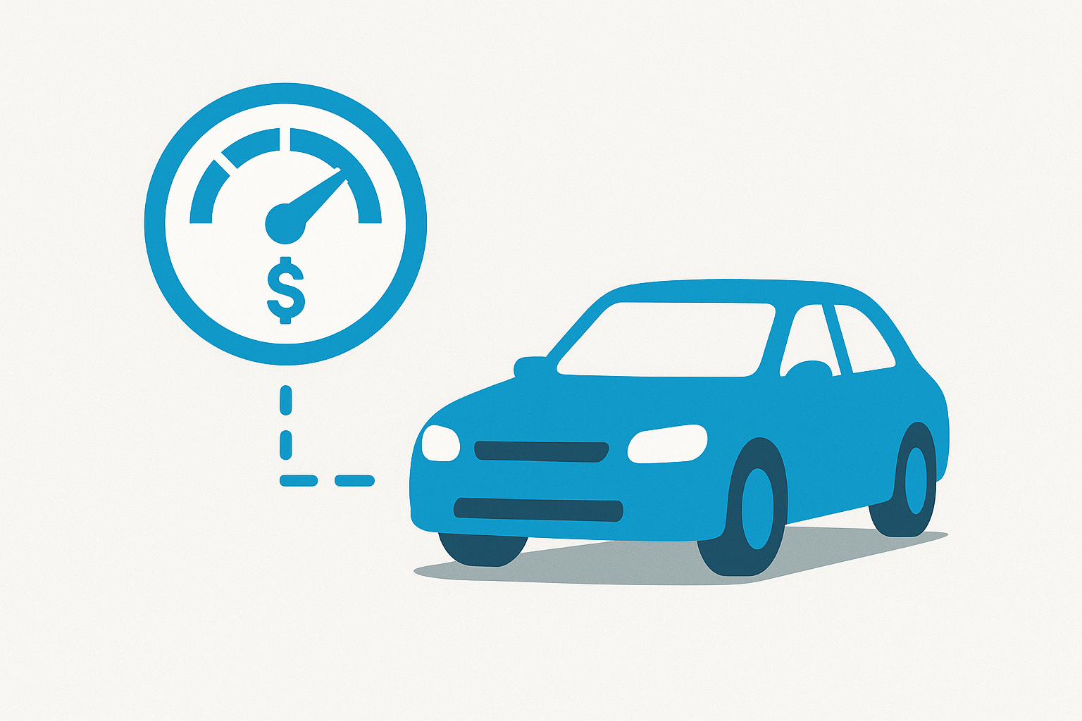
Our pay per mile and safety-based insurance model was novel, and consumers generally fear what they don't understand.
Customers didn't have all insurance documents handy when they came to rent the vehicle(s).
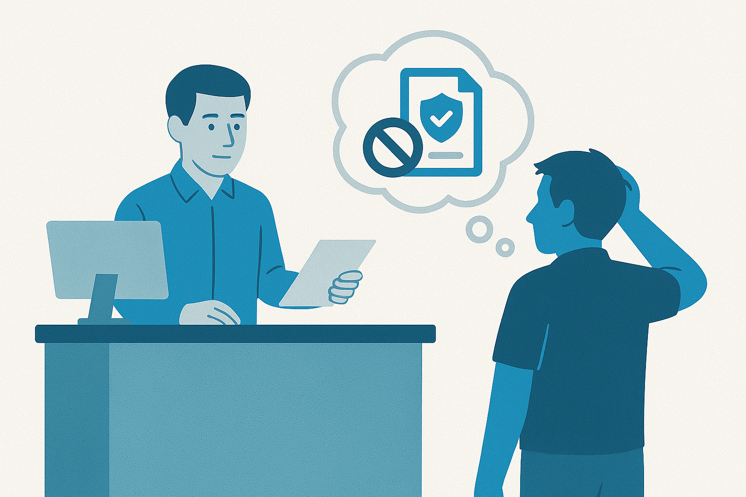
We didn't have time or bandwidth to integrate standard tools that could automate a lot of the work.
How do we design a buying experience so seamless and transparent that adding insurance feels automatic?
✅ Solution
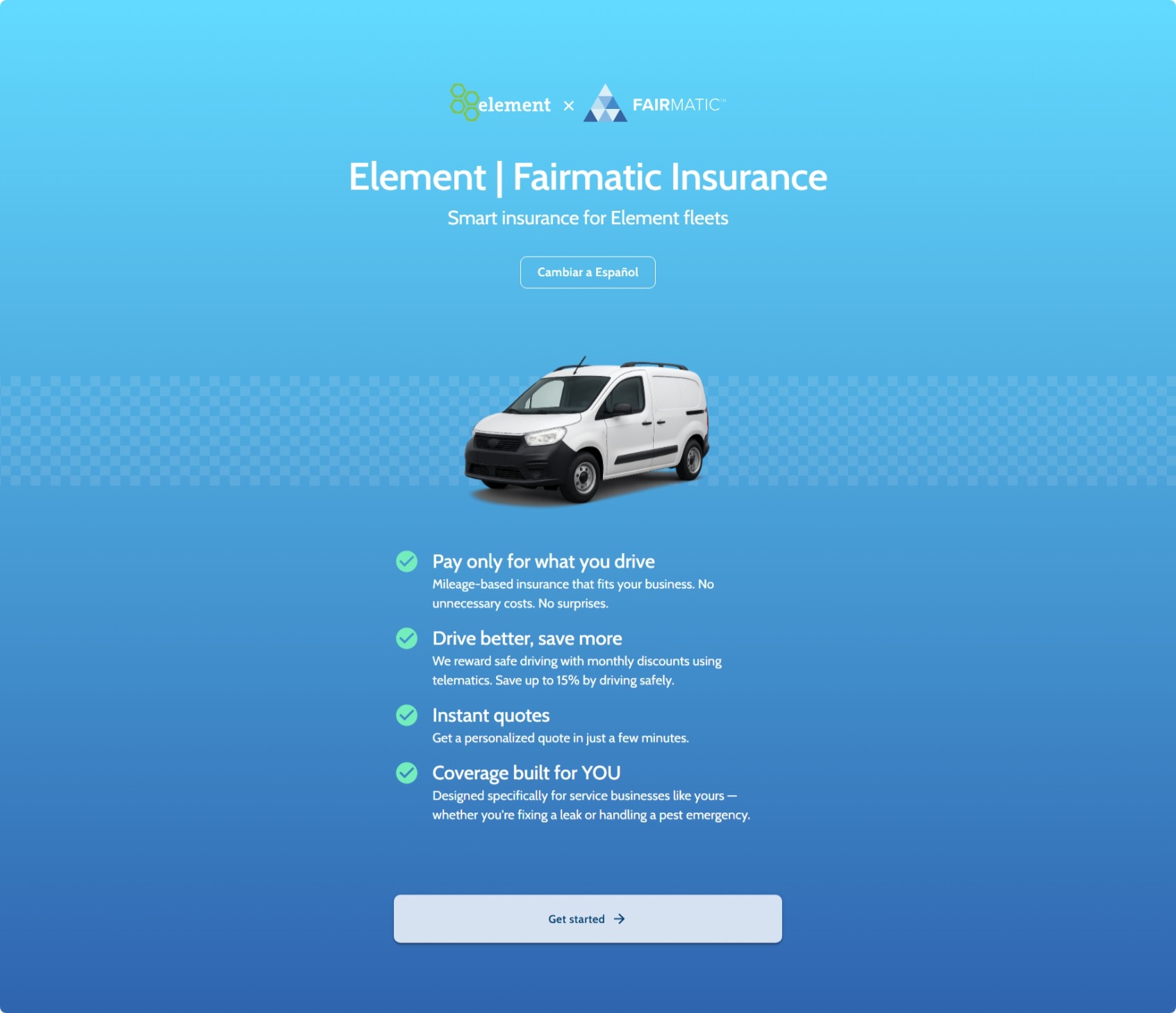
So instead of starting with a long application form, we flipped the flow. Customers would answer just a few essential questions, things they already knew by heart, and immediately see a quote. We built the experience to be:
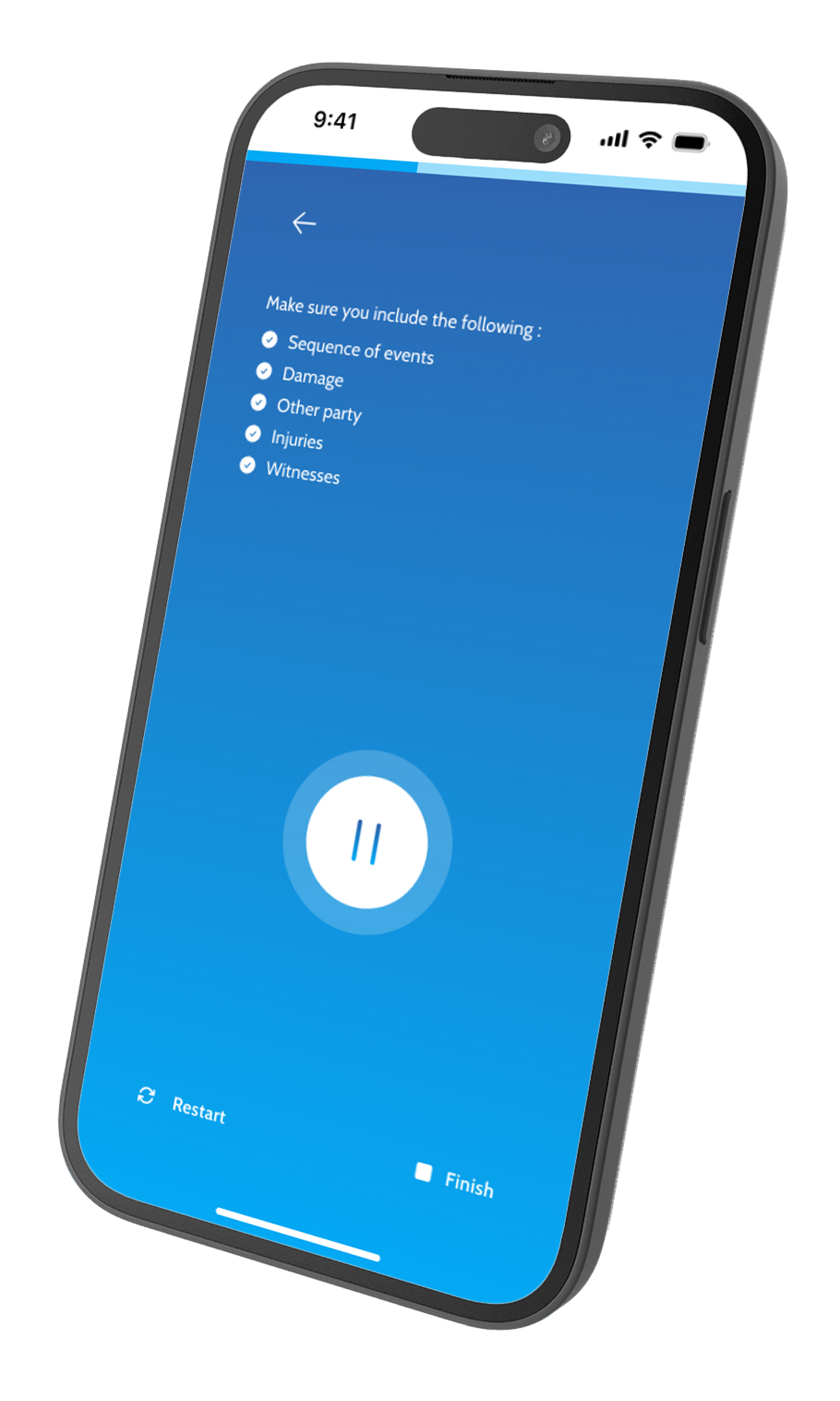
iPad-first: Designed for the in-store iPad Kiosk.
Effortless: From 50+ confusing inputs down to just 4 essentials sections.
Transparent: Clear progress indicators and upfront costs, no hidden steps.
Trust-building: Plain language, not legal jargon, so drivers knew what they were signing up for.
Localized: Built with multi-language support (e.g. Spanish for Mexico) to feel native to drivers across regions.
Key highlights :
Using visuals to tell a story
Users appreciated how the story was told through the same type of vans they would rent, with the driving and roadblock metaphor resonating well.

A simpler quote display
The removal of insurance jargons as well as presence of helper text meant that most of the users were able to understand what they were buying.

Simplified terms and conditions
IA grouped into buckets based on their relationship.

A hacky payment experience
Due to time constraints, we had to rely on a subpar experience of wire transfer which did cause issues in the end.

This experience is best viewed on an iPad.
📈 Impact

On pitch day, we skipped slides and let the partner try it as their own customer. In under a minute, they had a quote, understood coverage, and saw the fleet benefits. The reaction was instant: customers could use it unaided, costs would drop, and it would work in the real world. That confidence led to a $100M proposal, proof that design can win at the highest stakes.
⚙️ Process

Due to NDA, contact me at adithkvn@gmail.com for specifics.
- Gathered and defined problem based on stakeholder interviews and process audit
- Defined workflow for quoting by collaborating with team
- Tested concepts internally and iterated to improve workflow
- Tested with customers in spare/afforded time


💎 How Design Added Value
- Partnered with stakeholders to define the minimum required data for quoting.
- Established a consumer-friendly tone of voice and simplified language.
- Improved existing UX gaps—such as how quotes are displayed.
- Aligned cross-functional teams on a shared vision.
- Designed for a physical context—ensured accessibility, readability, and fast comprehension in a kiosk-based iPad interface.
- Ran internal testing and gathered feedback from synthetic users and userinterviews.com due to lack of time for real-user testing.
📚 Learnings
- Constant, direct collaboration is the fastest and most effective way to deliver high-quality outcomes.
- A short timeline doesn't limit impact—smart prioritization and focus can lead to powerful results.
- Designing for physical contexts (in-store kiosks) requires anticipating environment constraints—like lighting, attention span, and ergonomics.
🔄 What could've been done better
- User testing across demographies
- Testing for localization sensitivity
THE END